
Step into the realm of refined interior design with our interactive guide on selecting the ideal wall-cladding color combinations for your minimalist luxury abode.
Whether you’re a seasoned homemaker with an eye for detail, a visionary architect shaping spaces, or an aficionado of sleek design, this blog is crafted to assist you in crafting a sanctuary that radiates elegance and sophistication.
Join us as we delve into the art of blending hues and textures to elevate your living environment to unparalleled levels of sophistication.
1. Understand Your Aesthetic Vision
Before diving into color selections, take a moment to envision the overall aesthetic you desire for your home. Are you drawn to serene neutrals, bold contrasts, or subtle pastels? Understanding your aesthetic vision will serve as a guiding light throughout the selection process.
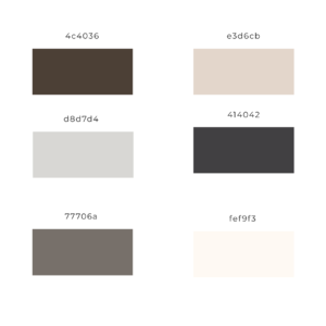
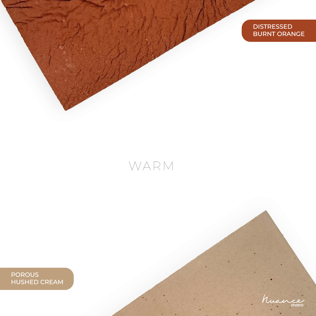
To assist your aesthetic choice we at Nuance have 16 standardized colors for our concrete wall panels. This wide range of natural earthy tones can help you achieve the ultimate aesthetics for your luxury indoors and outdoors.
Aesthetic vision in color selection, both indoors and out, requires a careful balance of harmony, contrast, and mood. Renowned designers such as Kelly Wearstler emphasize the importance of understanding how colors affect people and their surroundings (Wearstler, 2020).
Following COVID, there has been a clear shift towards subdued and pastel colors in interior and exterior design. This tendency reflects a widespread desire for peace, calm, and comfort in places where people spend long periods. Designers like Emily Henderson advocate for using soft, relaxing colors to create a sense of retreat and relaxation (Henderson, 2021).
2. Embrace Neutrals as a Foundation
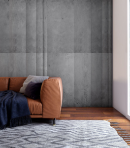
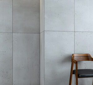
Neutrals, such as whites, grays, and beiges, are the cornerstone of minimalist design. They provide a timeless elegance and serve as a versatile backdrop for accent colors and textures. Consider opting for a neutral base for your wall cladding to achieve a sense of understated luxury.
Using neutrals as a foundation in design is like having a blank canvas waiting for your creative strokes, and experimenting with color palettes is where the fun begins! Think of it as your color playground.
For starters, you can experiment with monochromatic themes by utilizing multiple shades of the same neutral color, such as mixing different tones of beige or gray for a sophisticated look. If you’re feeling daring, consider complementary colors – combine warm neutrals with cool blues or grays for a balanced, eye-catching effect.
Alternatively, for a calm and harmonious look, use analogous colors, which involve pairing neutrals with neighboring hues on the color wheel.
3. Explore Contrasting Accents
While neutrals form the foundation, introducing contrasting accents can add depth and visual interest to your space. Think of deep charcoal grays against crisp whites or rich navy blues paired with warm beiges. These contrasting accents can be incorporated through strategically placed accent walls or complementary furniture and decor.
Exploring contrasting accents in minimalist wall cladding, both indoors and outdoors, is a unique method to add visual interest and depth to a space while keeping it clean and modern. Indoors, use materials with contrasting textures, such as smooth concrete and rough stone, or sleek metal accents against natural wood.
These contrasting textures can make a strong visual impact while keeping the overall appearance simple. Furthermore, incorporating contrasting colors, such as mixing a neutral backdrop with bright flashes of color in artwork or furnishings, can bring attention to specific areas of the wall and create a focus point.
Outdoors, experiment with material combinations such as smooth stucco against rough brick or wood paneling with sleek metal accents. By experimenting with materials that have contrasting colors, textures, and finishes, you may create a visually dynamic outside wall that sticks out while being simple.
Consider using architectural elements like geometric patterns or asymmetrical shapes to increase the contrast and visual intrigue of the wall cladding.
Finally, exploring contrasting highlights in minimalist wall cladding involves careful consideration of materials, textures, colors, and architecture.
4. Play with Texture
Texture is a powerful tool in minimalist design, adding dimension and tactile appeal to your space. When selecting wall cladding colors, consider textures such as matte finishes, brushed metals, or natural stone veneers. These textures can elevate the visual appeal of your walls while maintaining a sleek and refined aesthetic.
When integrating simple textures in wall cladding, it’s critical to establish a delicate balance that improves the overall appearance while not dominating the space. One way is to juxtaposition different textures to provide visual interest while retaining a consistent appearance.
For example, you might choose a matte finish for the majority of the wall and strategically insert brushed metal or natural stone veneer accents to draw the eye and provide dimension.
Begin by deciding on a primary texture for the majority of the wall cladding, such as a smooth matte finish in a neutral color like white or light gray. This creates a clean and subtle backdrop that establishes the mood of the space.
5. Consider the Interplay of Light
Lighting plays a crucial role in how colors are perceived within a space. Natural light can enhance the warmth of neutral tones, while artificial lighting can amplify the richness of accent colors. When choosing wall cladding colors, consider how different lighting conditions will affect their appearance throughout the day.
Indirect lighting has been getting a lot of attention from designers and architects. One of the key benefits of indirect lighting is its ability to distribute light evenly throughout a room, minimizing harsh contrasts and creating a sense of spaciousness. It can also be used to accentuate textures, colors, and shapes in the environment, adding depth and visual interest to the space.
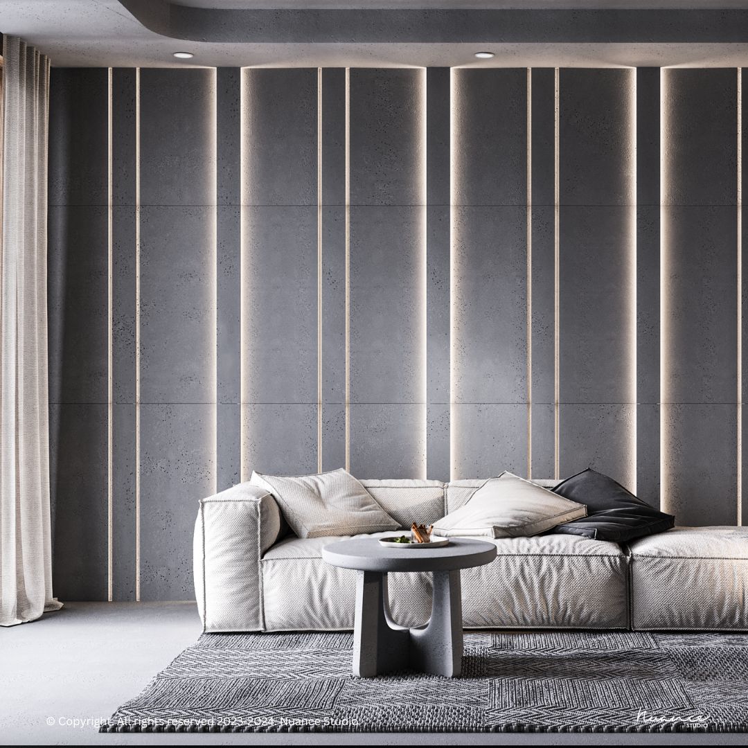
Indirect lighting can be achieved using a variety of fixtures, including recessed lights, wall sconces, cove lighting, and LED strips. These fixtures can be installed in various locations, such as above cabinets, along baseboards, or behind architectural elements, to create different effects and moods.
One emerging trend in interior lighting design is the use of light-integrated wall panels. These panels incorporate built-in LED lighting systems, allowing them to serve as both decorative elements and sources of illumination. Light-integrated wall panels come in a range of materials, shapes, and sizes, making them suitable for a wide range of design styles and applications.
6. Seek Inspiration from Nature
Nature is the ultimate source of inspiration for minimalist design. Draw inspiration from natural elements such as wood grains, stone textures, and earthy hues. Incorporating these organic elements into your wall-cladding color palette can evoke a sense of tranquility and harmony within your home.
7. Maintain Visual Continuity
In a minimal luxury home, visual continuity is key to creating a cohesive and harmonious space. Choose wall-cladding colors that flow seamlessly from one room to the next, creating a sense of unity and balance throughout your home. This continuity can be achieved through subtle variations of hue or by selecting complementary colors from the same color family.
8. Consider the Psychological Impact
Colors have the power to influence our moods and emotions. When selecting wall-cladding colors for your home, consider the psychological impact you want to achieve in each space. Soft blues and greens can promote calm and relaxation, while bold reds and yellows can energize and invigorate.
9. Don’t Overlook the Details
In minimalist design, it’s often the smallest details that make the biggest impact. Pay attention to the finer details of your wall cladding, such as grout color, trim profiles, and installation patterns. These subtle details can elevate the overall aesthetic of your space and contribute to its luxurious ambiance.
10. Trust Your Instincts
Ultimately, choosing wall cladding colors for your minimal luxury home is a highly personal decision. Trust your instincts and select colors that resonate with you on a deep level. Whether you’re drawn to serene neutrals or bold contrasts, the most important thing is to create a space that reflects your unique style and personality.
Takeaways
Selecting aesthetic wall cladding color combinations for a minimal luxury home is a thoughtful process that requires careful consideration of aesthetics, textures, lighting, and personal preferences.
By embracing neutrals as a foundation, exploring contrasting accents, playing with texture, and seeking inspiration from nature, you can create a space that exudes elegance and sophistication.
Remember to maintain visual continuity, consider the psychological impact of color, and pay attention to the finer details to elevate your living space to new heights. Trust your instincts, and enjoy the journey of transforming your home into a sanctuary of minimalist luxury.